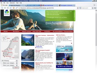
Here is Part III of "A Week at the Opera" brought to you by the TechWrap.
Today, I load up Opera and I noticed a left-most button. Naturally, I clicked it. Out came a sidebar that shows Bookmarks, Transfers, History and Links. The last thing that it shows is the really cool notes. Basically, you can type little notes to yourself. For me this is a big help because I always have to remind myself, "Edit HTML on the site" or "Make a podcast today." Very cool feature that is probably available on Firefox through some obscure extension. Definitely a +.
I'm subscribed to about 11 feeds through Firefox. I had heard from previous sources that Opera's RSS feed reader is amazing. However, I beg to differ. To look at a feed you have to go to the very top and hit the feed button. Then you have to select which feed to view. Then once you decide which one to view you have to look at all the different articles. In Firefox, they only take, really, the most recent articles for you to see and it is in a nice chronological order from newest to oldest. With Opera it goes from oldest to newest! Which means you have to scroll all the way down just to see the newer articles.
When you click an article it doesn't take you to the feed location (as in the site itself). No, it just shows the text of the article. Well that defeats the purpose of even looking at the internet in the first place! Everything should be all feeds according to Opera (at least that's how it seems).
With Firefox, it is quick. It is easy. It is better. Period. It is right there in your browser where it is extremely easy to see. Then you just click it and voila all the articles are right in front of you. When you click an article it takes you to the site!
Also, Opera does not have the standard RSS logo. I'll give them leeway on this just because it is most likely coming in the newest version. Hopefully....
Tags:


4 comments:
Um, Opera works like most standard feed readers, as far as I know. It shows you the full text a lot of the time, or just parts of it, and you can click a link to go to the actual blog post.
And you can click the different columns to sort entries the way you want.
yes, however if it were to show me the actual post then I would at least like to see pictures or some type of graphics.
Furthermore, I don't want a typical RSS reader. I just would like a Firefox RSS reader. Something that is quick and allows me to easily see the titles and somthing that allows me to jump right to it.
On the page for any given feed, go to View->Display->Suppress external embeds (should be unchecked)
That will allow you to see images where the page author has made them available.
In the same View menu, you can also set the time period of the articles displayed. For example, you can tell the feed reader to only display posts from the recent day, week, month, etc.
I agree that using the Feeds menu is a bit unwieldy, which is why I use M2 (Opera's built in mail reader) in Opera's sidebar to read feeds. In general, I find that not having to visit a ton of different webpages everyday is really nice. All the news I want is sent and stored on my computer (until I delete it) so I can look at it whenever I want, and it's fully searchable, too. If you use M2, news articles can also be labeled (Important, Valuable, Todo, Funny, etc).
It's a different feed-reading philosophy I guess (having just headlines vs full articles). When I have to use Firefox, I prefer the Sage extension to read feeds. In some ways, I feel, it's not as powerful as Opera's feed reader, but in other ways, I find it even better.
Anyhow, good luck with your Opera testing. Even if you decide it's not for you, it's great that you're taking the time to try it for yourself, to see if it fits your specific needs.
thanks for taking the time for writing that huge comment.
yea i think it just is feed reading philosophy and just some people like it different than others.
Post a Comment